Why Most Websites Underperform, and How to Fix Yours

A small business owner staring at his company website on a laptop, looking stressed and confused, in an empty store.

So, you’ve got a website. Maybe you built it yourself, maybe you paid a small fortune for it, or maybe your neighbor’s best friend’s roommate threw something together in exchange for your Netflix password. Whatever the case, it exists. But here’s the real question—is it working for you?


If you’re reading this, chances are, you think your website could do better. Maybe people visit but never reach out. Maybe they land on your homepage and bounce after a cursory glance. Maybe your website is just kind of… there, like a digital business card that nobody actually picks up.


If that sounds familiar, don’t worry—you’re not alone! Most websites underperform not because they’re ugly, outdated, or missing the latest flashy widgets, but because they were built with the wrong mindset. And today, we’re going to fix that.

The Real Reason Most Websites Underperform

Here’s the harsh truth: your website isn’t about you.


I know, I know. That stings a little. You worked hard on that About page, carefully crafted your mission statement, and maybe even spent hours picking the perfect shade of blue for your buttons. But if your website is all about your business and not your audience, that’s where the problem starts.


Most businesses fall into the same trap—treating their website like an online brochure, packed with company history, product features, and industry jargon. Meanwhile, visitors are landing on your site asking:

•  Can this help me?

•  Do I trust this person/business?

•  What do I do next?

And if your website doesn’t answer these questions immediately, people leave. That’s why websites with high bounce rates and low conversions often have one thing in common—they are focused on what the business wants to say, not what the visitor needs to hear.

How to Flip the Script and Make Your Website Work for You

A high-performing website isn’t just a digital placeholder. It’s a conversation—one where the visitor instantly feels seen, understood, guided, and encouraged to take action. So… let’s get into how to make that happen.

1. Speak to Your Audience, Not at Them


Your website copy should feel like a warm handshake, not a corporate presentation. Instead of leading with “We are an award-winning agency with 20 years of experience”, try “Frustrated with a website that doesn’t bring results? Here’s how we fix that.”


See the difference? One talks about the business. The other talks to the visitor. Your goal is to make people feel like your website was built just for them.

Quick Fix:

  • Read your homepage out loud. Does it sound like you’re having a real conversation, or does it feel like a stiff sales pitch?
  • Count how many times you use “we” or “our.” Then, replace some of them with “you” or “your.”

2. Design Your Homepage Like a Journey, Not a Billboard

Your homepage isn’t just a place to dump company information—it’s a pathway that guides visitors to exactly where they need to go.

Here’s how to structure it:

  • The first thing visitors see (aka “above the fold”): A clear, benefit-driven statement about how you help them. (Not just “Welcome to our website!” Please, no.)
  • Then, show them what working with you looks like and how it solves their problems. This could be with bullet points, a visual flow, or a before-and-after example.
  • A little social proof. Testimonials, logos of brands you’ve worked with, or success stories.
  • Finally: A clear, unmissable call to action. What do you want them to do next? Book a call? Download a guide? Buy a product? Make it obvious.

Quick Fix:


  • If your homepage is a giant wall of text, break it up. White space is your friend.
  • Does every section naturally lead to the next? If not, rework it so visitors want to keep scrolling, and you keep rewarding them for doing so.

3. Remove the Roadblocks to Action


People are impatient, especially on the internet. If they have to search for how to contact you, figure out what you offer, or click through multiple pages to find your pricing, they’re likely going to bounce.


Make things stupidly easy:

  • Put your Call To Action (CTA) where people actually see it. Not just at the bottom of a page, or just in your menu, though these are classically good spots. The point is, right in their line of sight.
  • Simplify your contact forms. Do you really need their mother’s maiden name and their childhood pet’s birthday? Statistcs indicate that visitors are increasingly losing patience with complex contact forms.
  • Ensure your site works on mobile. More than half of web traffic is mobile (a lot more), and if your site isn’t easy to navigate on a phone, you’re losing potential customers.

Quick Fix:


  • Ask a friend (who hasn’t seen your website before) to find your contact form and book a call. If it takes them more than 10 seconds, simplify it.

Signs Your Website Needs a Strategy Overhaul


Still not sure if your website is working the way it should? If any of these sound familiar, it’s time for a change:


  • People visit, but nobody reaches out.
  • You have no idea how visitors are actually using your site.
  • Friends and family tell you your website “looks nice” but don’t actually seem interested in what you do.
  • You’re constantly explaining your business because your website doesn’t do it clearly.


If you nodded along to any of these, it’s time for an upgrade.


Good news? That’s what I do.


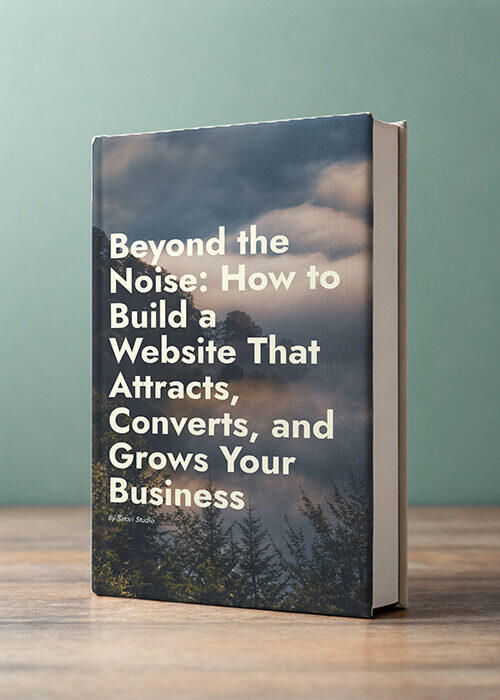
👉 Get my free guide, Beyond the Noise: How to Build A Website That Attracts, Converts, and Grows Your Business to learn exactly how to transform your website into a lead-generating machine. Download it here.

Final Thoughts: Your Website Should Work for You, Not Against You


Your website isn’t a static business card—it’s an active part of your brand that should attract, engage, and convert. If it’s not doing that, it’s just taking up digital space.


More good news is that you likely don’t need to rebuild from scratch—you just need to rethink how your website speaks to and serves your ideal audience.


So, let’s get to work. Start by implementing these quick fixes, and if you want a more in-depth roadmap, grab my free guide, Beyond the Noise below. It’s packed with insights I’ve gained over years of experience that have helped me to build websites that actually work.

E-Book cover - Beyond The Noise: How To Build a Website That Attracts, Converts, and Grows Your Business

Ready to Make Your Website Your Best Team Member?

What if your website could be more than just a digital brochure? Drawing from my own trial, error, and refinement, I’ve distilled the essential principles that transform websites from passive platforms into powerful growth engines. 


None of this is academic theory or fluff—it’s field-tested wisdom, that I wish I had when I was starting out.

Related Posts

A close-up of a human eye with a computer screen reflection in the pupil

The First Impression That Makes or Breaks Your Website

Ever landed on a website and thought, “Nope, not today,” before clicking away faster than you can say “404 error”? You’re not alone. Online, first impressions are everything, and happen in the blink of an eye. Let’s dive into why that is and how you can make sure your website is turning heads—in a good way.

Read More
Icon of a sprouting plant.

Every conversation is an opportunity for growth.

Ready to chat about possibilities? Let’s have a heart-to-heart about your vision and goals in a free 30-minute conversation. Or, shoot me an email. No pressure, just exploration.